|
Is The Wrong Typeface Ruining Your Ads and Brochures?
I've reviewed countless real estate ads, flyers and agent brochures. A common problem I see is the incorrect choice of typefaces. Fortunately, this error is easy to avoid with a little basic knowledge about typefaces. Here's the information you'll need to select the right typeface every time you create a print ad or brochure.
Typefaces
Roman - is the most widely used type group. Most books use a roman typeface because of its unmatched readability. It has two common features:
- Serifs
- the little tails appearing at the end of the main strokes of most letters. These help the reader to recognize letters and is the major reason this typeface is easy to read.
- The thick and thin variations within each letter.
Sans Serif - Also known as "Gothic" and "Block Letter". This typeface family has no serifs and each letter has a common thickness. Sans serif type can easily become boring. For this reason, it works best in headlines and subheads, where larger type is used.
 and and  - These are harder to read than the first two typefaces. They work well when you want to create a feeling with your ad. Typically these work best when used in bold headlines. The most common examples are cursive or script typefaces used mostly in headlines. - These are harder to read than the first two typefaces. They work well when you want to create a feeling with your ad. Typically these work best when used in bold headlines. The most common examples are cursive or script typefaces used mostly in headlines.
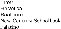
Here are the most widely used typefaces because of their readability:
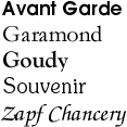
Here are several typefaces that are also popular:
Rules For Selecting and Using Typefaces
Choose your type and stick to it. Repeated use will build recognition.
Use the largest type possible in your ads without crowding.
Don't set type too wide. It will be hard to read.
Don't set type too narrow. Crowding makes it hard to read. Research shows readers use the white space around type to identify letters.
Use capital letters sparingly. They are harder to read than lower case letters. This is a common mistake made by real estate advertisers.
Use white space generously.
Use combinations of type sparingly. Too many typefaces will detract from your ad or brochure content. A good rule is to stop at two, and never use more than three different typefaces.
Back to Articles Main Page Next Article  |